design · brand · May 2024
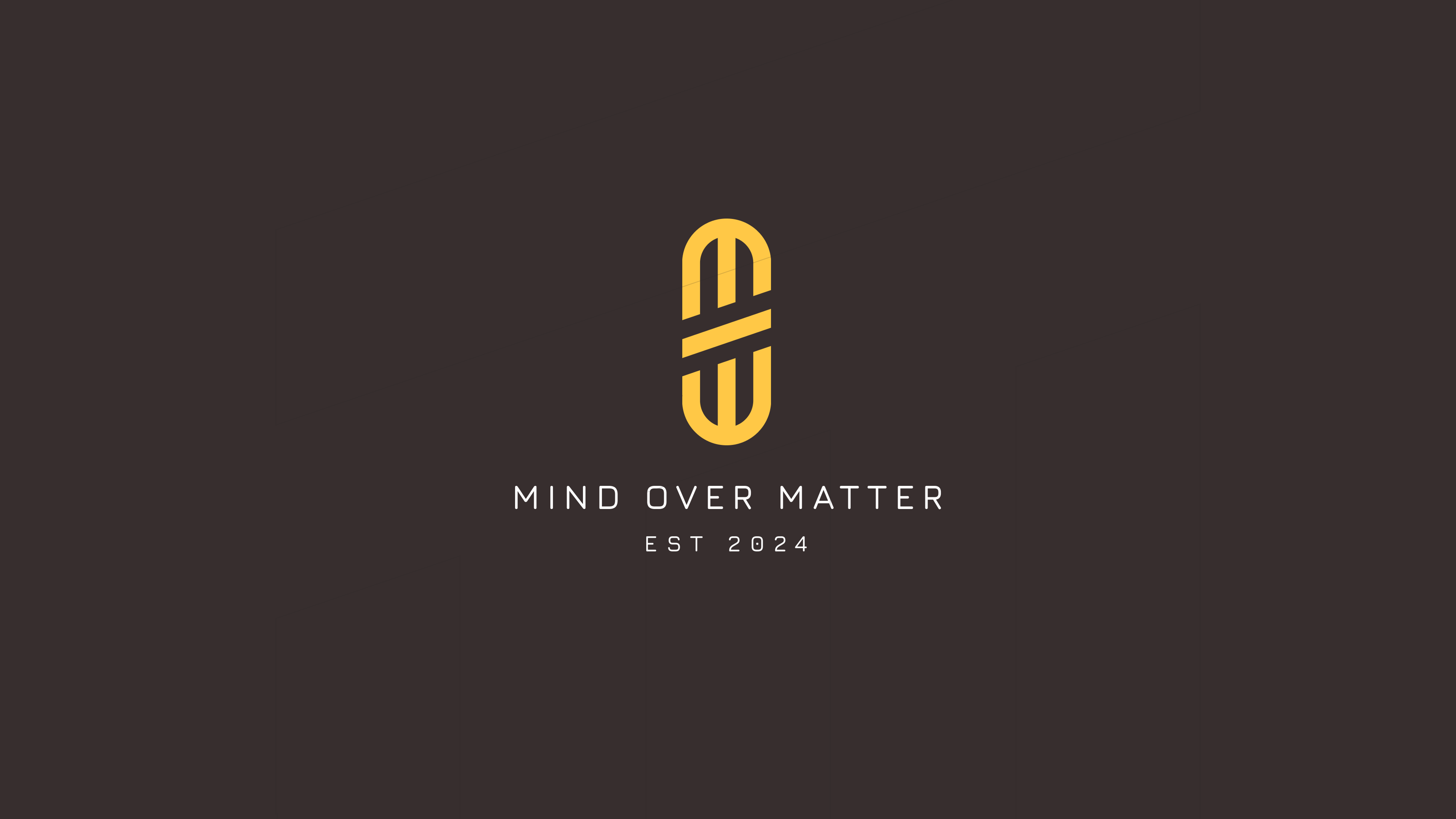
Mind Over Matter Branding | Fitness
The Mind Over Matter brand speaks to individuals who are looking to transcend how their body feels and to unlock new stages of themselves. The project involved thinking through what power can look like outside of the physical body.
 Expand
Mind Over Matter Branding | Fitness
When I started working on Mind Over Matter, I was not just designing another fitness brand. I was stepping into a question. What does power look like when it is not defined by muscle, weight, or appearance. The core idea was rooted in helping people transcend how their body feels and unlock new stages of themselves. From the beginning, I knew this brand had to speak to something deeper than performance. It had to feel like an internal shift, not just a physical one.
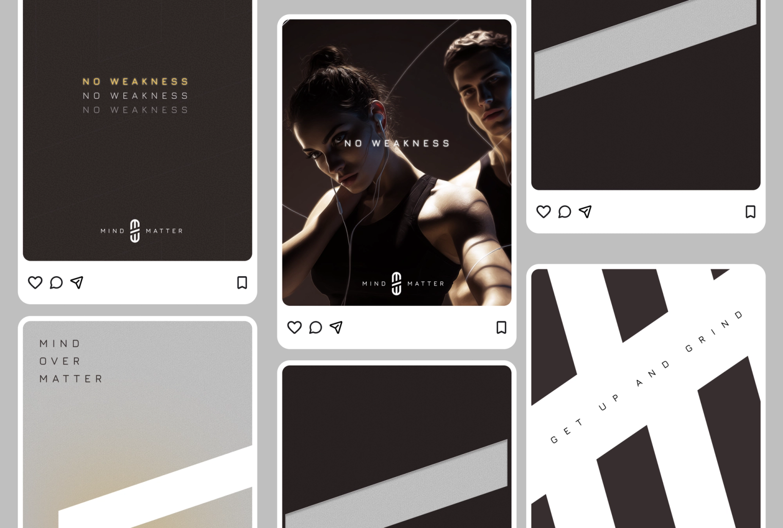
Mind over Screen
By the end of the process, Mind Over Matter had become more than a visual identity. It became a narrative of transformation. The final brand system was built to live across digital platforms, apparel, and social spaces while staying emotionally consistent. It was designed to meet people where they are and remind them that strength is not just something you build in the gym. It is something you develop within yourself.
-
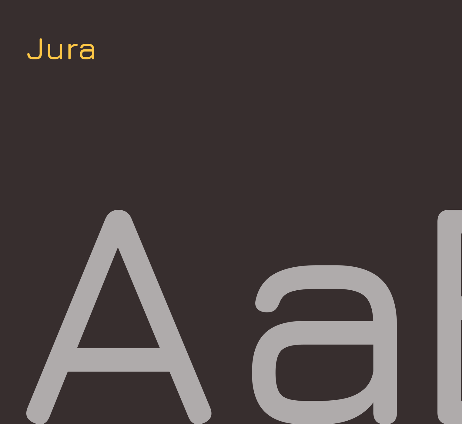
As the project unfolded, I began translating that philosophy into visual language. I explored how tension, movement, and space could represent growth and mental resilience. Every design decision was intentional. Typography needed to feel strong but not loud. Layouts needed to breathe while still carrying energy. The goal was to create a system that felt disciplined, focused, and powerful without becoming aggressive or exclusive. I wanted the brand to motivate people quietly but confidently.
-
A key turning point in the project was developing the iconography system and logo structure around the brand’s core values. I translated abstract traits like bravery, support, strength, stability, adaptability, and rootedness into simple geometric forms that felt intentional and symbolic. Each icon was designed to share visual DNA with the main logo so the system felt unified rather than decorative. This allowed the brand to communicate its values visually, even without words, creating a modular identity that could be used across interfaces, apparel, social content, and physical spaces while reinforcing the deeper philosophy behind the brand.

Conclusion
This project reinforced for me that the strongest brands are not built on aesthetics alone. They are built on meaning. Mind Over Matter challenged me to design with intention, emotion, and purpose. It reminded me that great branding does not just sell a product or a service. It creates a feeling. And in this case, that feeling was empowerment from the inside out.