brand · design
Evolufy Africa
We re-imagined a grassroots charity—formerly DellasDiary Foundation—into a next-gen NGO focused on mentorship, skills and "level-up" support for Africa's young talent. The new identity had to feel aspirational but never corporate: a brand that speaks to protégés in classrooms today and the leaders they'll become tomorrow.
 Expand
Evolufy Africa
Growth, Amplified
We re-imagined a grassroots charity—formerly DellasDiary Foundation—into a next-gen NGO focused on mentorship, skills and "level-up" support for Africa's young talent. The new identity had to feel aspirational but never corporate: a brand that speaks to protégés in classrooms today and the leaders they'll become tomorrow.
TLDR
DellasDiary Foundation had outgrown its charity roots after eight years of impact through school drives, orphanage visits, and scholarships.
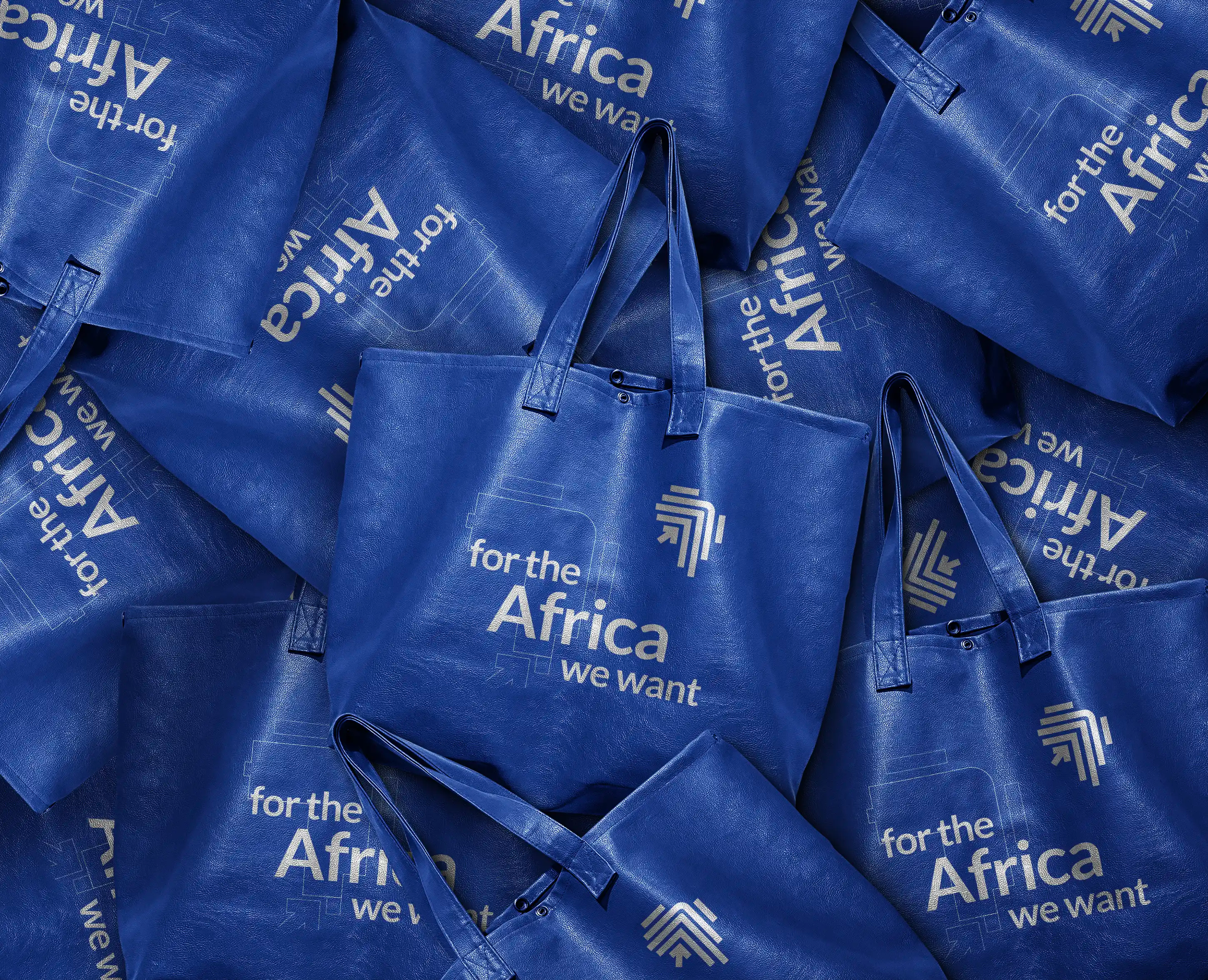
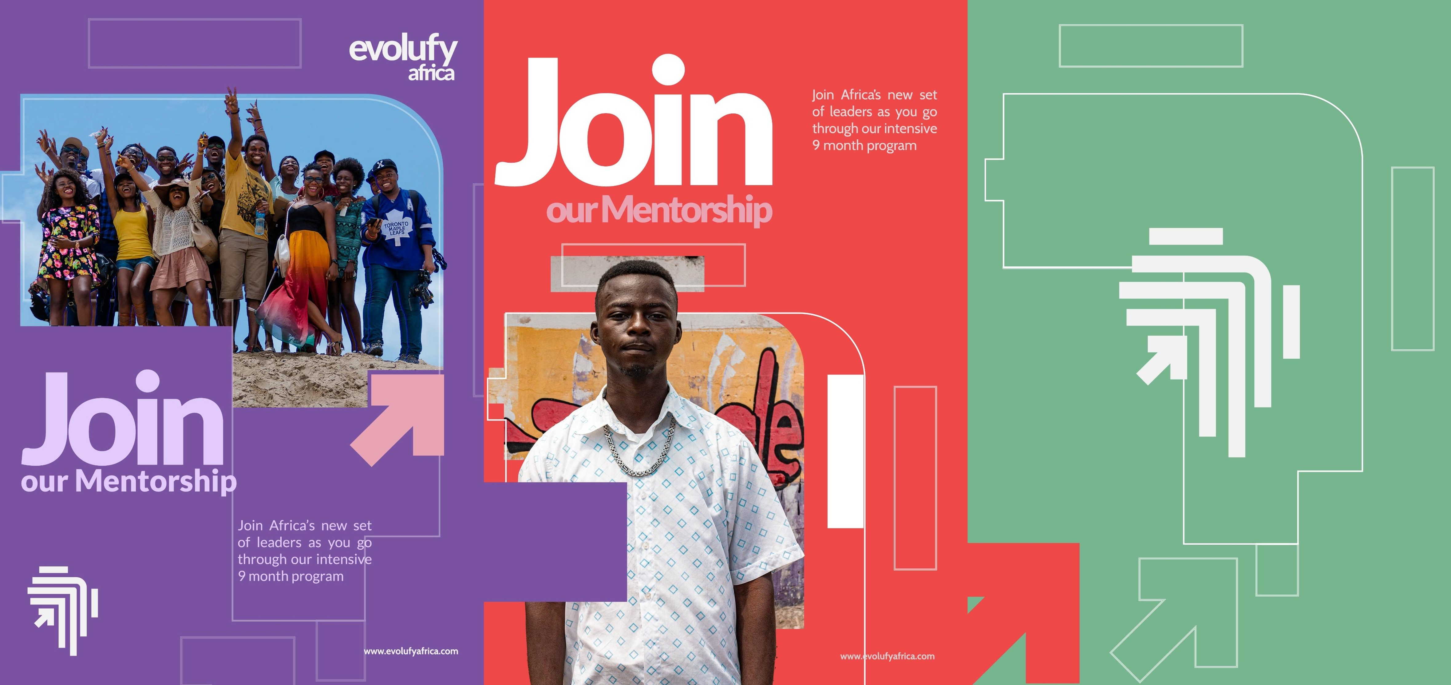
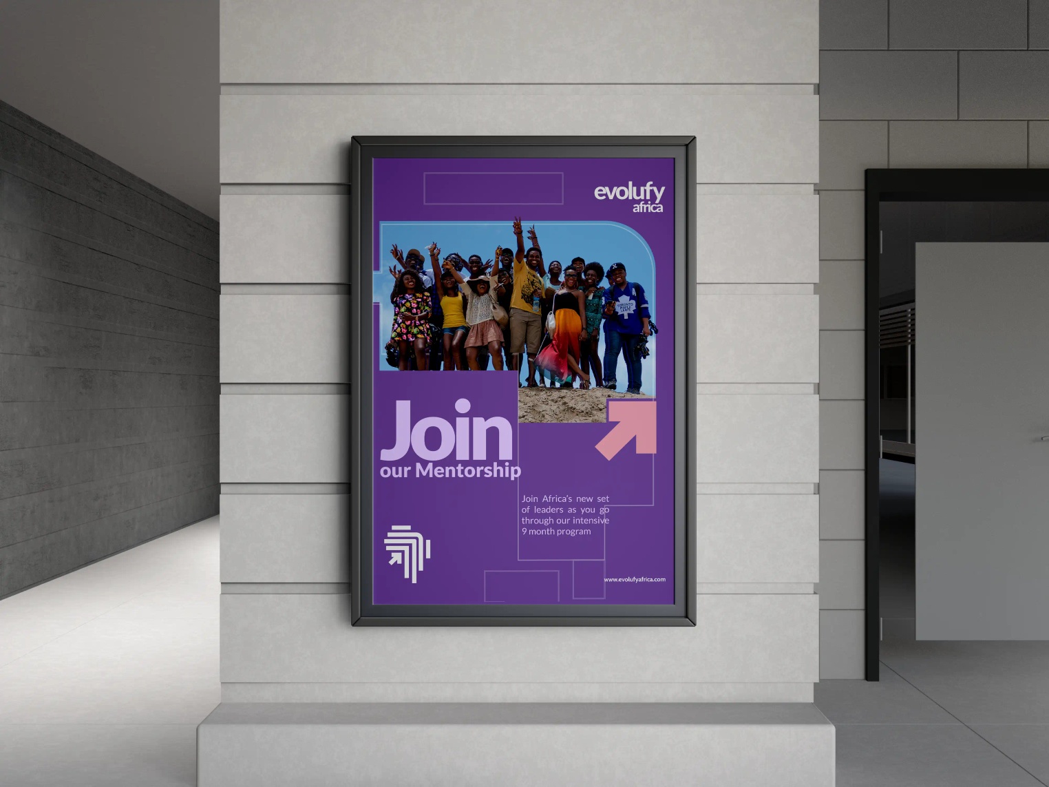
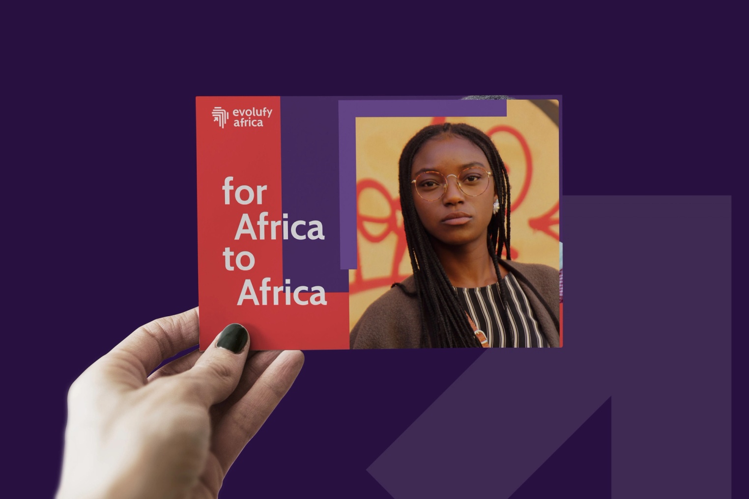
Through interviews with students, volunteers, and partner schools, we discovered a critical identity gap—the brand signaled "charity" when the organization had evolved into a catalyst for youth empowerment. We rebranded the foundation as Evolufy Africa, anchored by three strategic pillars: Growth, Support, and Africa. The new identity celebrates potential over need, featuring a wordmark with stepped terminals that hint at upward momentum and a symbol of interlocked chevrons forming an "EA" monogram that doubles as open wings.
The rebrand positioned the organization to speak directly to Generation-Z's desire for mentorship, resources, and agency, with a confident, peer-to-peer tone and design principle of "simple forms, bold stories" that reflects an unapologetically African future.
Context
DellasDiary began as a shoestring charity: school drives, orphanage visits, ad-hoc scholarships. Eight years on, its impact (and ambition) had outgrown the name. Interviews with students, volunteers and partner schools revealed three things:
- Identity lag – The foundation's brand signaled "charity," not "catalyst."
- Generation-Z mindset – Youth wanted mentorship, resources and a sense of agency.
- Pan-African vision – "Africa is the future," not a place of lack.
Strategy
Growth × Support × Africa
We anchored the story on three pillars the team repeats like a mantra—Growth, Support, Africa—and built a narrative that celebrates potential rather than need. The name Evolufy fuses evolve and amplify, telegraphing upward momentum.
- Brand Idea – "Level-up wings."
- Tone of Voice – "Confident, uplifting, peer-to-peer."
- Design Principle – "Simple forms, bold stories"
Logo
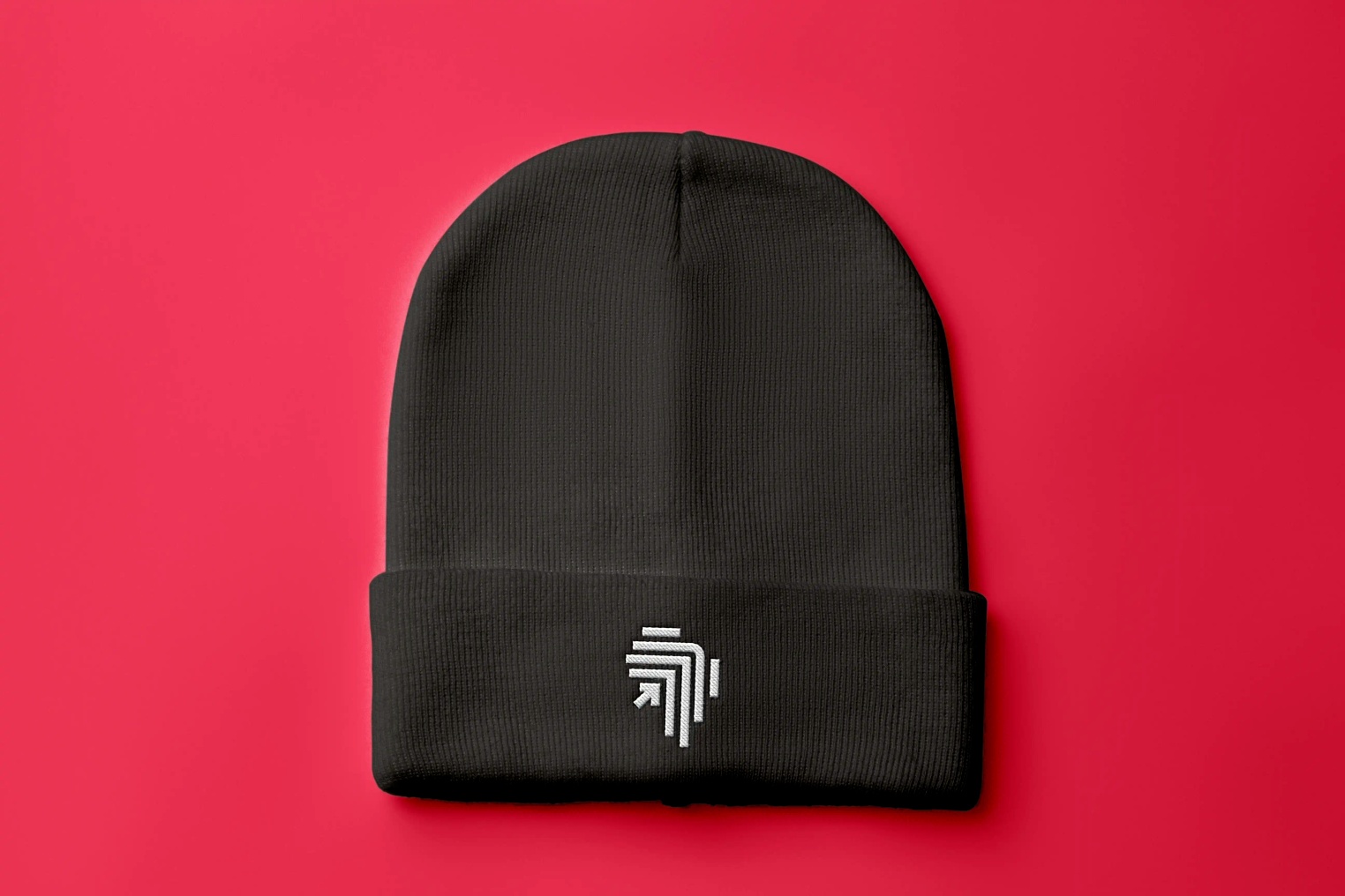
The wordmark's stepped terminals hint at a rising bar chart while echoing traditional African weaving patterns. The symbol—two interlocked chevrons—creates a subtle "EA" monogram that doubles as open wings, visual shorthand for mentorship that lifts you higher.
Retrospective
Rebranding a beloved grassroots organization always carries risk—there's an emotional attachment to the old name and a fear that change will alienate loyal supporters.
What made this project succeed was centering the voices of the students themselves throughout the process. Their feedback wasn't just informative; it was directive. They told us they wanted to be seen as future leaders, not charity cases, and every design decision flowed from that insight.
If I were to approach this project again, I'd invest even more time in co-creation workshops where students could contribute directly to visual concepts and messaging. The rebrand proved that when you give young people a brand that reflects their ambitions and agency, they don't just engage with it—they embody it.
Evolufy Africa is no longer just an organization; it's a movement, and that shift from passive beneficiary to active participant is the most powerful outcome any rebrand can achieve.